@keyframes 关键帧动画 设置动画名字
以百分百来规定改变发生的时间 或者通过关键词“from”和“to”,等价于 0% 和 100%
0% 是动画的开始时间 100% 动画的结束时间
HTML部分:
<section></section>
<div></div>
css部分:
        body{
            margin: 0;
        }
        section{
            width: 100px;
            height: 100px;
            background-color: red;
            animation-name: colors,rotate;
            animation-duration: 5s;
            animation-timing-function: linear;
            animation-iteration-count: infinite;
            /*animation: colors 5s linear infinite;*/
            transform-origin: -50px -50px;
            position: absolute;
            top: 300px;
            left: 50%;
        }
        div{
            width: 10px;
            height: 10px;
            background-color: red;
            position: absolute;
            top: calc(300px - 55px);
            left: calc(50% - 55px);
        }
        @keyframes rotate{
            from{
                transform: rotate(0);
            }
            to{
                transform: rotate(360deg);
            }
        }
        @keyframes colors{
            0%{
                background-color: red;
            }
            15%{
                background-color: green;
            }
            30%{
                background-color: yellow;
            }
            45%{
                background-color: cyan;
            }
            60%{
                background-color: blue;
            }
            75%{
                background-color: purple;
            }
            85%{
                background-color: orange;
            }
            100%{
                background-color: darkcyan;
            }
        }
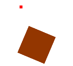
演示效果:(打不开情况下请右键在新标签中打开)