
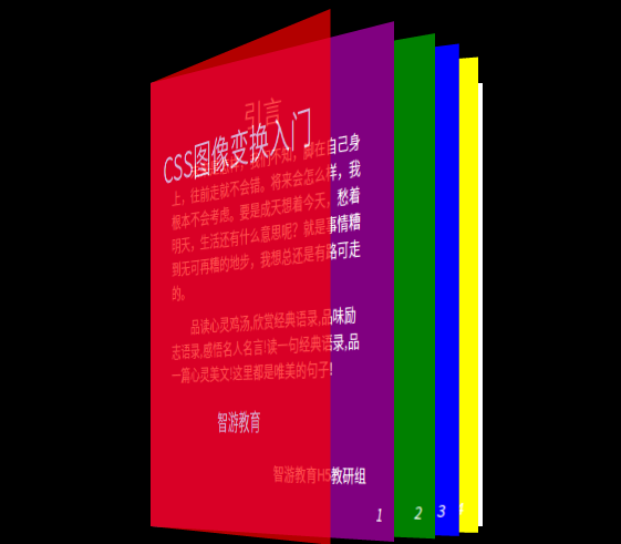
3D书页,动画效果截图不出来,下载素材体验。
代码书中:
<html>

<head>

    <meta charset="UTF-8">

    <title>3D书页</title>

    <style>

        body{

            background-color: black;

            color: white;

            -moz-user-select: none;

        }

        main{

            width: 300px;

            height: 400px;

            background-color: white;

            margin: 250px auto 0 auto;

            position: relative;

            perspective: 1500px;

            /*改变镜头的位置角度*/

            perspective-origin: 30% 80%;

        }

        section{

            width: 100%;

            height: 100%;

            position: absolute;

            top: 0;

            left: 0;

            /*改变旋转的基本点*/

            transform-origin: 0 0 0;

            transition: transform 2s;

        }

        section:nth-child(1){

            background-color: yellow;

            transform: rotateY(-20deg);

        }

        section:nth-child(2){

            background-color: blue;

            transform: rotateY(-30deg);

        }

        section:nth-child(3){

            background-color: green;

            transform: rotateY(-38deg);

        }

        section:nth-child(4){

            background-color: purple;

            transform: rotateY(-48deg);

        }

        section:nth-child(4) h2{

            text-align: center;

            margin-top: 30px;

            margin-bottom: 10px;

            font-weight: normal;

        }

        section:nth-child(4) p{

            font-size: 13px;

            margin: 10px 30px;

            text-indent: 2em;

        }

        section:nth-child(4) span{

            position: absolute;

            right: 30px;

            bottom: 40px;

            font-size: 13px;

        }

        section:nth-child(5){

            background-color: red;

            transform: rotateY(-60deg);

            opacity: 0.7;

        }

        section i{

            position: absolute;

            right: 13px;

            bottom: 10px;

            font-size: 13px;

        }

        section:nth-child(5) h1{

            position: absolute;

            top: 30px;

            left: 25px;

            font-size: 32px;

            font-weight: normal;

        }

        section:nth-child(5) span{

            position: absolute;

            bottom: 80px;

            left: 125px;

            font-size: 18px;

        }

        section:nth-child(5):active{

            transform: rotateY(-120deg);

        }

    </style>

</head>

<body>

    <main>

        <section>

            <i>4</i>

        </section>

        <section>

            <i>3</i>

        </section>

        <section>

            <i>2</i>

        </section>

        <section>

            <h2>引言</h2>

            <p>未来是怎样,我们不知,脚在自己身上,往前走就不会错。将来会怎么样,我根本不会考虑。要是成天想着今天,愁着明天,生活还有什么意思呢?就是事情糟到无可再糟的地步,我想总还是有路可走的。</p>

            <p>品读心灵鸡汤,欣赏经典语录,品味励志语录,感悟名人名言!读一句经典语录,品一篇心灵美文!这里都是唯美的句子!</p>

            <span>智游教育H5教研组</span>

            <i>1</i>

        </section>

        <section>

            <h1>CSS图像变换入门</h1>

            <span>智游教育</span>

        </section>

    </main>

</body>

</html>


😀 看起来挺好玩。。。
可以试一下,要是全部页面都加上动画的话就挺不错的 😆
perspective-origin 改变镜头的位置角度
transform-origin 改变旋转的基本点
active 按下鼠标时执行的动作