2D动画
html
<body>
    <section>
        <section>
            <section></section>
        </section>
    </section>
</body>
css
body{
background-color: black;
}
body>section{
width: 300px;
height: 300px;
background-color: blue;
margin: 180px auto 10px;
}
body>section>section{
width: 300px;
height: 300px;
background-color: green;
opacity: 0.8;
/*transform 该属性允许我们对元素进行旋转、缩放、移动或倾斜*/
/*使......改变*/
/*transform: translate(50px,50px);*/
/*translate 平移 两个值 第一个值表示水平方向 第二个值代表垂直放向*/
/*transform: scale(0.8,0.3);*/
/*scale 缩放*/
/*transform: rotate(-30deg);*/
/*ratate 旋转*/
/*transform-origin: right bottom;*/
/*图形变换基准点*/
/*transform: skew(30deg,30deg);*/
/*skew 倾斜*/
/*transform: scale(0.8,0.6) translate(10px,10px) rotate(30deg) skew(20deg,20deg)*/
/*transform: matrix(0.6,0,0,0.6,0,0);*/
/*缩小 0.6*/
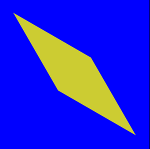
transform: matrix(-0.52,-0.3,-0.3,-0.52,0,0);
}
body>section>section>section{
width: 300px;
height: 300px;
background-color: yellow;
}
3D动画
html
同上
css
        body{
            background-color: black;
        }
        section{
            opacity: 0.85;
            perspective: 1500px;
            /*创建透视场景 让子元素形成透视效果 变换中也支持透视函数
              perspective 属性设置镜头到元素平面的距离*/
            transform-origin: 80% 50%;
            /*调整观察者的位置 属性规定了镜头在平面上的位置 默认是放在元素的中心*/
            transform-style: preserve-3d;
        }
        body>section{
            width: 300px;
            height: 300px;
            background-color: blue;
            margin: 200px auto 10px;
            transform: rotateY(30deg);
        }
        body>section>section{
            width: 300px;
            height: 300px;
            background-color: green;
            margin: 0;
            transform: rotateY(70deg);
        }
        body>section>section>section{
            width: 300px;
            height: 300px;
            background-color: yellow;
            margin: 0;
            transform: translate3d(0,0,60px) rotate3d(0,1,1,30deg) scale3d(0,0,80px);
        }
演示
推荐阅读